The Gantt Chart: Why a 100-Year-Old Tool Still Runs Modern Projects
Deadlines don’t fail projects. Poor visibility does.
Walk into any serious project review meeting, whether it’s a SaaS rollout, a construction milestone review, or a product marketing launch, and you’ll notice something consistent. The calmest teams are not the busiest. They are the ones who can see their progress clearly.
That clarity still comes from a tool introduced over a century ago by Henry Gantt.
Despite AI dashboards, agile boards, and automation software, the Gantt chart remains the backbone of structured planning. It answers three questions leaders have always asked:
- What needs to be done?
- When will it be completed?
- What happens if something slips?
And it answers them in one visual framework.
Today, that framework is powered by modern Gantt chart maker platforms, including RocketSlide, bringing executive-ready polish to a time-tested structure.
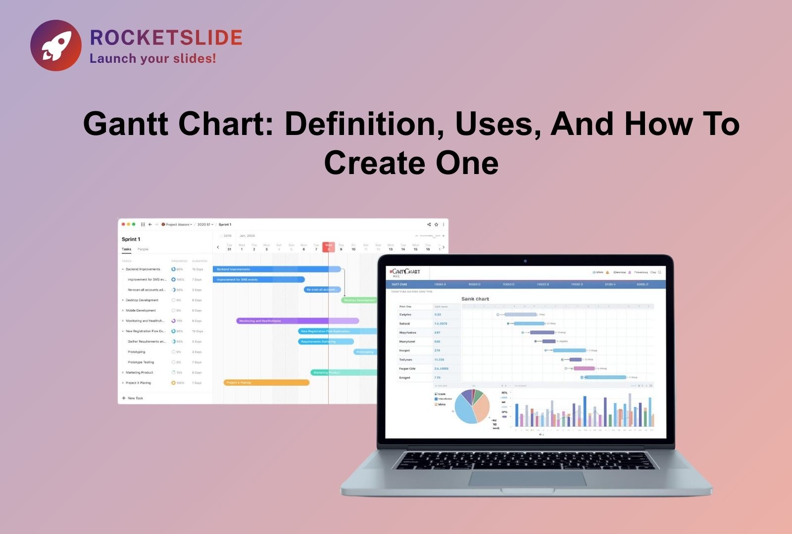
What Is a Gantt Chart?
At its core, a Gantt chart is a visual scheduling tool that maps tasks against time.
Here’s how it works:
- Vertical Axis: Lists all project tasks.
- Horizontal Axis: Displays time (days, weeks, or months).
- Horizontal Bars: Represent the duration of each task.
- Dependencies: Show how tasks are connected.
It looks simple. But simplicity is its strength.
According to cognitive research from MIT, the human brain processes visual information significantly faster than text-based information. In project environments, this translates directly into fewer misunderstandings, fewer clarification meetings, and faster decision-making.
A Gantt chart does something most spreadsheets cannot: it shows how time flows through your project.
A Brief History
Though the chart carries the name of Henry Gantt, who popularized it between 1910 and 1915, its conceptual foundation dates back to 1896, when Polish engineer Karol Adamiecki introduced a similar system called the “harmonogram.”
Henry Gantt refined the idea during the industrial era. His charts were used extensively during World War I and later in massive infrastructure projects. Most notably, the Hoover Dam, completed in 1936, benefited from disciplined scheduling practices rooted in Gantt-style visualization.
What’s fascinating is this: despite the rise of agile boards, Kanban systems, and AI planning tools, the Gantt chart never disappeared. It evolved.
That endurance speaks volumes.
Built on Industrial Discipline, Still Relevant Today
Massive infrastructure and wartime logistics demanded accountability and structure. That foundation still matters.
Modern projects may involve:
- UX design
- Backend engineering
- Compliance review
- Marketing automation
- Stakeholder reporting
But complexity hasn’t eliminated the need for structure. It has amplified it.
The Gantt chart evolved from paper boards to digital dashboards, but its philosophy remained: If you can see time, you can manage it.
Gantt Charts: Your Go-To Project Management Essential in 2026

1. Clarity in Multi-Layered Projects
Today’s teams operate across time zones and tools. Without a unified visual plan, fragmentation becomes the norm.
A structured Gantt chart template transforms a scattered task list into a coherent roadmap. Instead of guessing timelines, leaders present a structured progression.
This is especially powerful when visuals are clean and presentation-ready.
2. Bottlenecks Become Visible Before They Hurt
The true power of a Gantt chart lies in dependencies.
If one task is delayed, the ripple effect becomes immediately visible. This allows teams to protect the critical path early, before budget overruns or launch failures occur.
Projects rarely fail because people aren’t working.
They fail because interdependencies weren’t visible.
That’s where a digital Gantt chart maker changes the game, automatically adjusting timelines and flagging shifts in real time.
3. Executive-Level Communication
Boards, investors, and clients don’t want operational chaos. They want clarity.
A well-designed Gantt chart template:
- Shows milestones clearly
- Highlights the delivery phases
- Communicates risk zones
- Maintains visual consistency
In high-stakes environments, perception influences confidence. A polished timeline communicates preparation before you say a word.
The Evolution: From Static Charts to Intelligent Planning
We are entering a phase where AI enhances traditional frameworks instead of replacing them.
Modern Gantt chart maker platforms now:
- Suggest realistic timelines
- Detect scheduling conflicts
- Optimize layout for slides
- Maintain brand consistency
- Auto-adjust dependent tasks
This is not abandoning structure.
It is strengthening it.
The principle remains old-school discipline.
The execution is modern intelligence.
Introduction: How to Make a Gantt Chart
If you’re wondering how to make a Gantt chart, the answer today is less about mechanics and more about strategy.
It’s not simply about drawing bars across a timeline. It’s about:
- Defining milestones that matter
- Protecting the critical path
- Building buffers where risk exists
- Designing visuals that stakeholders trust
Older tools required hours of formatting.
RocketSlide removes that friction, allowing teams to focus on execution rather than layout alignment.
The process hasn’t changed.
The efficiency has.
If you’d like a step-by-step breakdown of the process, explore our detailed guide on how to make a Gantt chart for 2026.
Real-World Applications Across Industries
Gantt charts continue to power:
Marketing Campaigns
Coordinating landing pages, ads, email automation, and launch timing, ensuring no asset goes live prematurely.
Software Development
Mapping sprint cycles, QA testing, audits, and deployment windows for release-level visibility.
Event Planning
Managing venues, speakers, sponsorships, and ticket launches where timing errors are costly.
Across industries, one truth holds: Visibility creates control.
Why RocketSlide Works for Modern Teams
Traditional spreadsheets can technically build timelines. But they struggle with:
- Design consistency
- Dynamic dependencies
- Slide-ready exports
- Brand alignment
RocketSlide bridges that gap.
As a modern Gantt chart maker, it combines:
- Structured timeline logic
- Clean visual output
- Presentation-ready formatting
- Reusable Gantt chart template options
It transforms a project plan into a persuasive visual narrative.
And in 2026, narrative matters.
Final Thoughts
A Gantt chart is more than just a way to schedule tasks. It’s a practical way to see your entire project clearly. It helps you organize moving parts, reduce confusion, and bring different efforts together into one clear direction.
From its early use in large industrial projects to today’s AI-powered planning tools in 2026, the Gantt chart has remained useful because it solves a simple problem: making time and progress visible.
If you want to present your timelines with clarity and confidence, the right tools matter. Using a professional Gantt chart maker like RocketSlide, along with a well-designed Gantt chart template, helps you communicate your plan clearly and build trust with your team or stakeholders.
FAQs
1. Is a Gantt chart a tool?
Yes. A Gantt chart is a project management tool. It helps teams organize tasks, set deadlines, and understand how different activities are connected.
2. Why are Gantt charts still useful today?
Even with modern software and AI tools, projects still need clear planning. Gantt charts make timelines visible, help teams avoid delays, and improve communication. That’s why they remain widely used in 2026.
3. What is a Gantt chart maker?
A Gantt chart maker is software that helps you create Gantt charts quickly and easily. Instead of building timelines manually in spreadsheets, these tools generate structured visual charts automatically.
4. What is a Gantt chart template?
A Gantt chart template is a ready-made layout that you can customize for your project. It saves time and ensures your timeline looks clean and professional.
5. How to make a Gantt chart?
To make a Gantt chart, you:
- List all project tasks
- Set start and end dates
- Define task dependencies
- Add milestones
- Use a Gantt chart maker to create the visual timeline
Using a digital tool makes updates much easier.