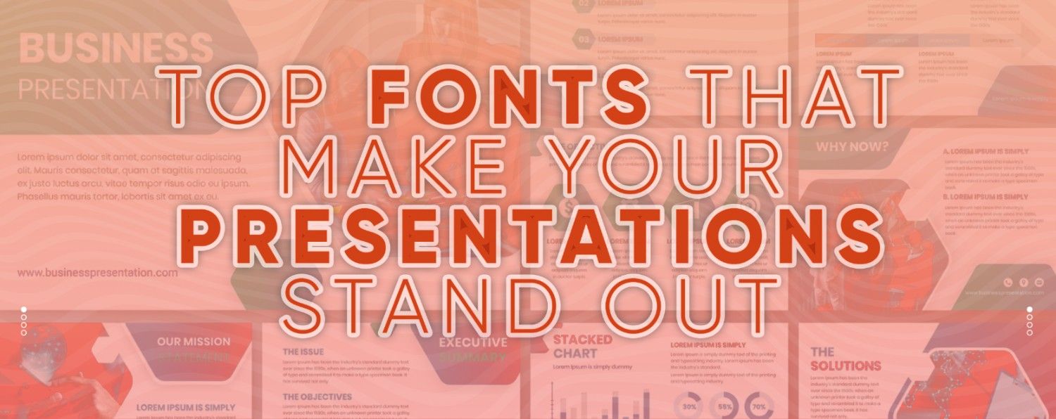
Why typography matters more than you think — and how to choose the right one for your deck
When designing a presentation, fonts are often an afterthought. But in reality, your choice of typography has a huge influence on how your message is perceived. It shapes how your content is read, how professional your slides appear, and how your audience connects with your story.
At RocketSlide, we understand that good design isn't just about colors and images, it's about clarity, consistency, and emotion, all of which fonts can deliver. Whether you're building slides from scratch or uploading a document for AI-powered conversion, choosing the right font makes a difference.
Why Fonts Play a Bigger Role Than You Realize
When designing a presentation, it’s easy to focus on the visuals, layout, or even the content itself — but often, the choice of fonts gets overlooked. Yet fonts do much more than just "look nice." They are a crucial part of how your audience perceives and interacts with your presentation.
Typography plays both a functional and psychological role in communication. The fonts you choose can shape not only how your message is read but also how it's felt. Here’s why font selection matters more than most people think:
1. Improve Readability
At the most basic level, fonts determine how easy your content is to read. A clear, legible font helps your audience absorb information quickly — especially when slides are viewed from a distance or projected during a live presentation. If your text is too small, overly stylized, or cramped, your message can get lost before it's even understood. Choosing a clean, readable typeface ensures your content is accessible to everyone in the room.
2. Set the Tone of Your Presentation
Fonts carry personality. Serif fonts like Times New Roman or Trocchi might suggest tradition, professionalism, or formality. Sans-serif fonts like Montserrat or Roboto often feel modern, clean, and tech-forward. A handwritten or decorative font might feel playful or creative — but could also risk looking unprofessional if used in the wrong context. The key is to select a font that complements your topic, audience, and the emotional tone you want to convey.
3. Support and Reinforce Your Brand Identity
Consistent typography is a core element of strong branding. Using the same font across your presentations, website, and marketing materials builds recognition and trust. If someone sees your slides and instantly knows they’re yours — without even seeing a logo — you’re doing branding right. A branded font choice subtly reminds your audience who you are, and it keeps your visual identity polished and cohesive.
4. Establish Visual Hierarchy
Fonts help guide your audience’s attention. By using different sizes, weights, and styles (sparingly and intentionally), you can structure your slides in a way that leads viewers through your story. For example, a bold headline draws attention first, followed by subheadings and then body text. This natural hierarchy helps break up information and prevents your slides from looking like one big block of text.
5. Keep Your Audience Focused
A poorly chosen font — whether it’s too decorative, too small, or just hard to read — can distract your audience and pull focus away from your actual message. On the other hand, a thoughtfully chosen font enhances your delivery. It works silently in the background, keeping viewers engaged, guiding their eyes smoothly from one point to the next.
Why Fonts Matter More Than You Think
Every presentation is an extension of your brand — whether internal or client-facing. That’s why tools like RocketSlide allow you to set a custom brand theme, including fonts, logos, and color palettes, so your slides always look aligned and polished.
Instead of adjusting font styles manually every time, you can apply your branded typography across the deck with one click. This saves time and ensures design consistency in every slide you deliver.
How to Choose the Right Presentation Font
Here are two questions to guide your decision:
- Does it reflect your brand personality? A clean sans serif might suit a tech startup, while a classic serif could match a law firm’s identity.
- Does it support your message? Fonts should enhance your story, not distract from it.
Six Presentation-Friendly Fonts to Try
If you're not sure where to start, here are six well-balanced fonts that are both stylish and effective for modern presentations:
1. Roboto
Simple, structured, and versatile. Roboto’s open curves and neutral tone make it perfect for long blocks of text or data-driven decks.
2. Poppins
A geometric sans serif that’s friendly yet professional. Its range of weights gives flexibility for headers, subheadings, or captions.
3. Trocchi
A contemporary slab serif that adds a classic touch without feeling outdated. Great for balance between tradition and modernity.
4. Jost
Inspired by modern digital aesthetics, Jost offers a clean, contemporary alternative to traditional fonts like Futura. Excellent for tech or creative presentations.
5. Montserrat
With roots in vintage signage, Montserrat is bold and characterful without being overwhelming. Use it for titles or to inject some personality into your deck.
6. Glodok
A display font with a bold, retro feel. Ideal for making your headers stand out while maintaining a structured, confident look.
Final Tip: Don’t Overcomplicate It
When choosing fonts, simplicity goes a long way. It's usually best to pick one font for your headings and another for the body text. This helps your slides stay clean, easy to follow, and visually balanced. Try not to mix too many styles or weights because it can make things look cluttered and distracting. A thoughtful, well-paired font choice makes your message easier to understand and gives your presentation a polished and confident feel.