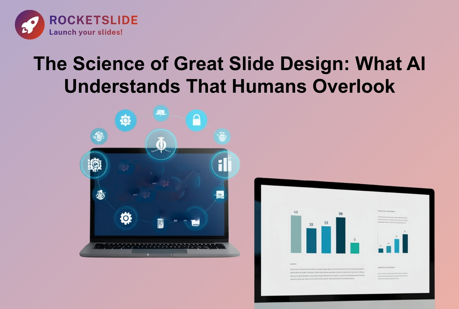
The Science of Great Slide Design: What AI Understands That Humans Overlook
February 06, 2026
•
DESIGN INSPIRATION
Introduction: How AI Applies Cognitive Science to Create Better Presentations
Anyone who has worked on an important presentation knows the struggle.
Hours spent on late-night sessions, meticulously aligning elements and nudging text boxes by a handful of pixels, only to still sense an underlying flaw.
In reality, effective presentations are rooted in how the human brain processes information.
At RocketSlide, we’ve been seeing how people create presentations and how audiences respond to them. One insight stands out clearly:
Humans focus on decorating.
AI focuses on structuring.
This article explores the principles of effective slide design, revealing how AI slides incorporate an understanding of attention, comprehension, and memory.
Less Information, Better Understanding
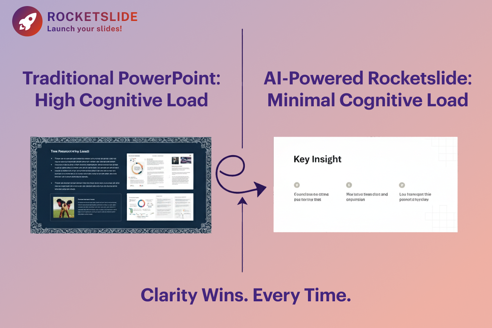
One of the most common mistakes in slide design is trying to say too much at once.
When learning how to create slides, many people feel the need to fill every space with context, explanations, or extra points. It feels helpful, but it often hurts understanding.
Cognitive Load Theory posits that the brain's capacity for simultaneous information processing is restricted. Consequently, when a slide is overly dense with information, understanding significantly decreases.
A modern slideshow maker powered by AI evaluates content density automatically. Instead of just placing text, it asks a more important question:
How much can the audience realistically absorb?
By reducing unnecessary cognitive effort, AI helps audiences focus on what actually matters.
How the Eye Really Scans a Slide
Audiences don’t read slides word by word. They scan.
Eye-tracking studies show that most viewers follow predictable patterns, often starting from the top left and moving across before scanning downward.
When slides are designed manually, key messages are often centered or evenly distributed. While this may look balanced, it doesn’t always align with how people actually look at slides.
AI-driven design systems are trained on large volumes of successful presentations. They understand where key information should appear so it’s noticed early and remembered longer.
That’s why a RocketSlide slide deck template isn’t just visually consistent; it’s intentionally structured to guide attention.
Color Is About Function, Not Preference
Color choices are often based on brand rules or personal taste. Blue feels professional. Red feels energetic.
But color plays a deeper role in cognition.
Research shows that certain color ranges can improve retention, while poor contrast can increase fatigue and reduce focus. Over time, this has a measurable impact on engagement.
AI design systems treat color as a functional layer. They manage contrast, readability, and emphasis automatically, ensuring slides remain comfortable to read, even in long presentations.
How Visual Structure Improves Understanding
A common workflow is to write the text first and then look for images that “match.”
The problem is that visuals don’t just decorate slides, but they also influence understanding.
According to dual-coding theory, learning improves when visual and verbal information support the same idea. When they don’t, retention suffers.
An AI slide generator evaluates the intent behind the text. Instead of adding generic images, it structures layouts that visually reinforce meaning using hierarchy, alignment, and direction to support the message.
Why Bullet Points Often Fail
Bullet points are popular because they’re easy.
Unfortunately, they’re also one of the fastest ways to lose attention.
Lists encourage passive reading. Audiences skim instead of engaging.
AI-driven slideshow maker tools recognize when information should be grouped, separated, or distributed across multiple slides. Instead of one dense slide, the content is broken into smaller, focused units that are easier to process.
The Power of White Space
Space often feels uncomfortable.
Many presenters assume that a slide with fewer elements looks unfinished. In reality, white space improves clarity, focus, and comprehension.
White space acts as “breathing room” for the brain. It helps define boundaries and reduces visual noise.
AI systems protect this space deliberately. By keeping visual density low, slides remain calm, readable, and easier to understand.
Where Humans Still Matter Most
AI is excellent at structure, hierarchy, and balance.
What it cannot replace is human judgment.
Stories, context, humor, and emotional insight still come from the presenter. The most effective presentations combine AI-driven structure with human storytelling.
This is why RocketSlide is built as a collaborative tool, not an automated replacement.
If you’re learning how to create slides that truly connect, this balance is essential.
The RocketSlide Approach
The RocketSlide workflow is simple:
- You define the message and intent
- The AI structures the slides using proven cognitive principles
- You refine tone, examples, and delivery
This approach removes friction while preserving creative control.
Final Thought
Great slide design isn’t about doing more. It’s about doing less, but intentionally.
When presentations respect how people think, scan, and remember, they become clearer and more persuasive.
AI doesn’t replace the presenter.
It removes the obstacles that get in the way.
With RocketSlide’s AI slides, the structure works, so your message can land.