That moment when you open a blank slide and it just... stares back at you. You know it needs more than bullet points, but the moment you start looking for background images, the second-guessing begins. Do you go for that stock photo of a handshake? Some moody gradient? Just keep it plain white and play it safe?
Here’s the truth: background images can absolutely elevate your slides—if you use them with purpose. Whether you're pitching to investors, explaining a big idea, or presenting to a room full of students, the right background sets the tone without distracting from the message.
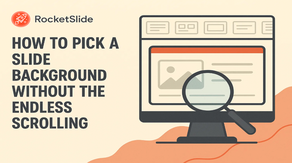
Let’s walk through how to choose one that works for you.
What Backgrounds Actually Do
Think of a background image like lighting at an event. It’s not the reason people showed up, but it sets the mood, frames the experience, and—when it’s done right—it quietly enhances everything else.
Done well, a background image helps you:
- Set a tone that fits the moment
- Keep your deck visually engaging
- Reinforce your brand’s look and feel
- Help your audience stay focused
If it’s doing anything else—pulling attention away, clashing with your content, making text hard to read—it’s probably doing too much.
Start with the Context, Not the Image
Before you open any stock photo site or AI image tool, pause for a second. Ask yourself:
Who’s going to see this deck?
You’re not designing for yourself — you’re designing for your audience.
Ask:
- Is this going to a technical product team who cares more about clarity than flash?
- Are you pitching to investors who expect polish and focus?
- Is this for students who need to stay engaged in a long lecture?
Where are you presenting?
The environment affects how your slides will look.
- Bright conference room? Light backgrounds with high contrast text work best.
- Dimly lit Zoom call or auditorium? Darker backgrounds might be easier on the eyes — and reduce glare.
What’s the tone you're going for?
Your background should match the vibe of your presentation.
- Serious update: Go clean and minimal — think muted tones, subtle gradients.
- Creative brainstorm: You can lean more playful — abstract patterns, soft color blends.
- Emotional pitch or story: A powerful photo background might work — but only if it doesn’t compete with your message.
How much text is on the slide?
This one’s huge. More text = more need for clarity.
- Just a headline? You have room for bold imagery behind the text.
- Bullets or paragraphs? Keep the background simple — even a slight texture or blur might be enough.
Knowing these things first makes picking a background image so much easier—because now you’re making a choice based on purpose, not just vibes.
A Few Guidelines That Actually Work
Here’s what makes a background image helpful (not harmful):
- Readability always comes first. No background is worth making your audience squint. High contrast is your friend.
- Visual flow matters. The image should guide people’s eyes toward your content—not pull them away with loud patterns or weird focal points.
- Keep colors intentional. Your brand palette is a good starting point, but remember color has emotional weight. Blues build trust. Reds energize. Neutrals calm. It all depends on the story you’re telling.
And yes, sometimes simple is best. A soft gradient or muted pattern can do more for your slides than a bold photo ever will.
What Style Should You Use?
There’s no one-size-fits-all. But here’s how to think about different styles:
- Gradients: Clean, modern, and always a safe bet. They make text pop without stealing attention.
- Abstract patterns: Great middle ground—creative but controlled. These add visual interest without overwhelming your message.
- Photos: Powerful, when they’re real and relevant. But stocky handshake photos? Hard pass.
- Blurred images: A strong option when you want to bring in photography but still keep the focus on your words.
Your choice should come down to tone, not trend.
A Quick Note on Quality
Resolution still matters. A pixelated background says, “I slapped this together at the last minute.” Aim for 1920x1080 or higher—and always check how it looks on the screen where you’ll be presenting. What looks great on your laptop might fall apart on a projector.
How RocketSlide Makes This Easier
Let’s be honest: finding the right background image can take longer than writing the slide. That’s why RocketSlide’s AI-powered platform helps take the guesswork out of it.
Instead of scrolling through endless options or fiddling with image placement, RocketSlide gives you:
- Smart layouts that automatically adjust text placement for clarity
- Brand-safe color and image suggestions
- Backgrounds that support your content—without a fight
- Built-in image tools, like background removal and scaling, that just work
You focus on the message. We handle the polish.
Final Gut Check
When you’re picking a background, ask:
- Does this make the content clearer—or harder to read?
- Would I present this in front of an investor or classroom?
- Does it feel on-brand and intentional?
- Does it support the message—or distract from it?
The best background images don’t shout. They just make your slides feel smart, clean, and easy to follow. And when it’s time to build your next high-stakes presentation, RocketSlide is here to help you make every slide count.