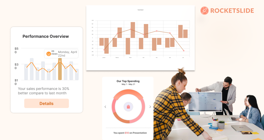

Sometimes, the hardest part of running a survey isn’t collecting the data — it’s figuring out how to present it in a way that actually makes sense to your audience. Whether you're getting ready for a team meeting, pitching to stakeholders, or just wrapping up a research project, knowing how to turn those numbers into clean, clear visuals is key. In this guide, we’ll show you how to present your survey results using PowerPoint or Google Slides—step by step, no fluff, just practical tips that work.
Understanding the Importance of Data Visualization
Effective data visualization isn't just about making your slides look pretty—it’s about enhancing understanding, retention, and engagement. For example, here's a guide on how to visualize sales funnels in one slide that applies the same principles to business presentations. Visual representation helps to distill complex information into digestible formats. According to studies, audiences are more likely to remember information presented visually than when presented only in text form.
Objectives of Data Visualization
- Clarification: Helps to clarify and emphasize key message points.
- Engagement: Captures the audience’s attention and keeps them interested.
- Retention: Aids memory retention and recall of information presented.
“Data visualization is the graphical representation of information and data. By using visual elements like charts, graphs, and maps, you can provide an accessible way to see and understand trends, outliers, and patterns in data.”
Preparing Your Data for Visualization
Before diving into PowerPoint or Google Slides, it’s crucial to prepare your data properly.
Data Cleaning and Organization
- Review Your Data: Check for inconsistencies or missing values. Tools like Excel can help identify outliers or areas where data cleansing is necessary.
- Segment Your Data: Organize your data into categories that make sense for your audience. This can involve providing context, such as demographics or geographical location.
Choose the Right Type of Visualization
Selecting the appropriate type of visual representation is critical. Common formats include:
- Bar Graphs: Great for comparing categories.
- Pie Charts: Useful for showing proportions.
- Line Charts: Ideal for demonstrating trends over time.
- Heat Maps: Effective for displaying data density across categories.
Designing Effective Slides in PowerPoint and Google Slides
Now that your data is ready, it’s time to create the visuals in either PowerPoint or Google Slides. While both platforms have their strengths, they also share many similar features.
Best Practices for Designing Slides
- Keep It Simple: The less cluttered your slide is, the more impactful your message will be. Limit the number of visuals per slide.
- Use Clear Labels: Ensure all axes, legends, and data points are clearly labeled. Avoid jargon if your audience may not be familiar with it.
- Maintain Consistency: Use a cohesive color palette and font style throughout to create a professional look. Tools like Canva can help you select complementary colors.
Tips for Using PowerPoint
- SmartArt and Chart Tools: Leverage SmartArt graphics to create diagrams or flowcharts quickly.
- Animation Features: Use animations judiciously to reveal data step-by-step, which can help emphasize key points without overwhelming viewers.
Tips for Using Google Slides
- Embedded Charts: Google Slides allows you to easily link charts from Google Sheets, making updates seamless.
- Collaborative Features: Take advantage of Google Slides’ real-time collaboration features to receive instant feedback and insights from peers.
Enhancing Your Presentation
While the data visualization is crucial, there are additional elements to consider that can elevate your presentation.
Incorporating Narratives
- Storytelling: Weave a story around your data. Begin with context, present the data, and conclude with implications. This narrative structure keeps your audience engaged.
Engaging Your Audience
- Ask Questions: Engage your audience by asking thought-provoking questions related to the data.
- Interactive Elements: Use tools like polls or quizzes to keep the presentation dynamic and involve participants actively.
Conclusion
Presenting survey data in a visual format is an essential skill in today’s information-rich landscape. By understanding the nuances of data preparation, selecting the right types of visuals, and creating compelling presentations in PowerPoint or Google Slides, you can ensure that your data resonates with your audience. Remember, the goal is to make your findings accessible and memorable.
Takeaway: Always prioritize clarity over complexity; the best visuals are the ones that convey your message at a glance.
Now that you have the tools and tips to effectively present your survey data, why not give it a try? Dive into your next project with confidence, and watch your data come to life on the screen!
Get the Latest Updates


