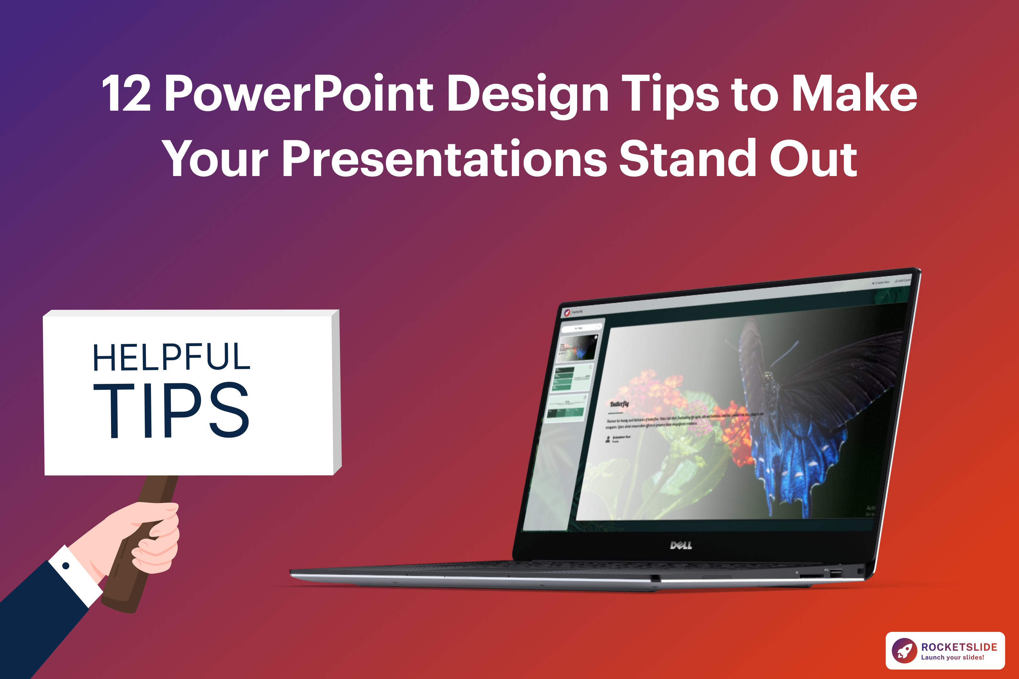
12 PowerPoint Design Tips to Make Your Presentations Stand Out
December 12, 2025
•
PRESENTATION TIPS
Introduction: PowerPoint Design Tips to Elevate Your Presentations
PowerPoint presentations are used everywhere in classrooms, boardrooms, online webinars, investor meetings, sales pitches, and internal training sessions. No matter what your industry or job title is, you’ll need to create a deck at some point.
An effective presentation has design principles that guide the audience’s attention, emotions, and overall clarity. If you’re a student creating a project report or a business professional pitching a new idea, learning how to improve your PowerPoint design skills is one of the smartest ways to elevate your communication through a presentation.
The good news is that you don’t need to be a designer to create polished, professional-looking slides. You just need the right platform, and that’s exactly what this guide delivers.
In this guide, we’ll explore 12 PowerPoint design tips that will help you create visually appealing, audience-friendly, and high-impact presentations with real examples, research-backed insights, and clear explanations that make design feel simple and enjoyable.
Why Presentation Design Matters
Today’s audiences are visually trained because they spend hours scrolling through highly polished content such as videos, graphics, reels, carousels, infographics, and modern websites. Now, their visual expectations have evolved.
This means that if your presentation doesn’t look professional, your message loses credibility, no matter how smart the content is.
Studies show that:
- People process visuals 60,000x faster than text
- Audiences remember 80% of what they see, but only 10% of what they hear
- Clean design increases retention and decision-making
If you want to learn how to turn your ideas into competitive slides, or if you are struggling with layout, colors, fonts, and flow, these tips will give you a complete roadmap.
1. Start With a Strong Visual Hierarchy
Your audience should never have to guess the most important message you are trying to convey, as visual hierarchy helps people quickly scan and understand a slide.
Here’s how to build it:
- Make your title the largest element
- Keep body text smaller and consistent
- Use bold or accent colors for emphasis
- Make sure spacing guides the viewer from top to bottom
Think of your slide as a story in visual form, and hierarchy ensures the story unfolds clearly.
Tip: Use fewer text sizes. Too many font variations create visual noise.
2. Use a Clean Layout
Using too much content is the biggest design mistake in PPT design.
To clean up your layout:
- Use margins generously
- Give every element breathing room
- Follow the Rule of Thirds for spacing
- Keep one idea per slide
Slides are not meant to be read like documents, but they are created to support your spoken message.
3. Use High-Quality Images
A stretched or blurry image instantly makes a slide look unprofessional.
Use the following good image rules:
- Use HD or vector images
- Avoid cheesy stock photos
- Keep imagery relevant, not decorative
- Maintain visual consistency across slides
Images are meant to enhance comprehension, not distract from it. If you’re presenting numbers or research, consider replacing images with icons, data visualizations, or minimal illustrations for a cleaner impact.
4. Keep Text Minimal
Presentations have different meanings from articles. Long text blocks slow down understanding and force the audience to choose between reading and listening.
Follow these text rules:
- Keep bullet points short
- Use keywords instead of full sentences
- Present one core idea per slide
- Remove filler words
If you need more content, break the slide into two or three slides. It’s better to have more slides than fewer slides with more text.
5. Use Consistent Typography
The wrong font can make a presentation feel childish or unprofessional, as it can communicate.
Here’s how to choose well:
- Use one primary font for titles
- Use one secondary font for body text
- Avoid overly decorative fonts
- Choose modern, clean typefaces
Recommended font families:
- Helvetica
- Inter
- Lato
- Poppins
- Calibri is reliable for business settings
6. Choose a Professional Color Scheme
Your color palette sets the tone of your entire presentation. Sleek, modern colors can make even simple slides look premium.
An attractive PowerPoint color scheme usually includes:
- 1 primary color (background or dominant shade)
- 1 secondary color (headers, visuals, shapes)
- 1 accent color (for emphasis, charts, or key points)
Your palette should feel consistent across all slides, not like a rainbow explosion.
If you want guidance on choosing the right palette for your slides, explore our complete article on how to choose the perfect color scheme for your presentation.
7. Use Visual Consistency for a Professional Look
Consistency makes the presentations more polished than amateur decks.
Consistency means:
- Uniform spacing
- Same font sizes for same-level text
- Same color for headings
- Same style of icons or images
- Matching corner radius for shapes
Your audience shouldn't feel like every slide belongs to a different presentation. Consistency makes your deck credible and easy to follow.
8. Replace Bullets with Visual Alternatives
Bullet points are useful, but using too many can make your slides feel dense.
Instead, you can try:
- Icons
- Mini infographics
- Checkmarks
- Horizontal layouts
- Image-backed statements
- Three-column layouts
9. Use White Space Like a Designer
White space is not wasted space, but it can give your slides clarity and elegance.
Benefits of white space:
- Reduces clutter
- Makes elements easier to read
- Highlights important information
- Creates visual calm
10. Use Smart Alignment
Alignment is one of the ways to improve your presentation. Use PowerPoint’s built-in alignment tools:
- Align left
- Center vertically
- Distribute evenly
- Snap objects to grid
11. Tell a Visual Story with Your Slides
Great presentation design is not about making each slide pretty. It’s about taking your audience through a narrative.
Here’s how to make your story work visually:
- Use section dividers
- Build slides in sequence
- Use icons or imagery that reinforce the message
- Add visual metaphors when appropriate
- Use animations sparingly and purposefully
12. Use AI Tools to Speed Up and Improve Design
Designing slides manually can take hours, sometimes even days. That’s why AI-powered presentation tools are becoming a game-changer for presenters, students, marketers, and businesses.
AI can help you:
- Auto-generate slide layouts
- Apply clean, modern color palettes
- Improve PPT design instantly
- Create consistency across the deck
- Reduce formatting time significantly
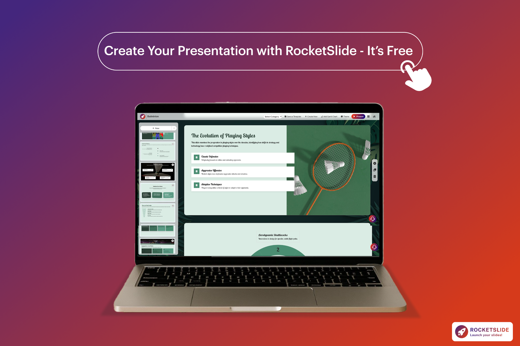
If you want to see how AI transforms the slide creation process, check out our guide on how AI-powered templates are transforming presentations. It also explains how RocketSlide AI handles spacing, color theory, layout generation, and typography, so you can spend more time perfecting your message rather than formatting slides. RocketSlide removes the busywork so your ideas can shine.
Conclusion:
By applying these 12 PowerPoint presentation tips, your slides will look more polished, your message will land more clearly, and your story will flow in a way that keeps your audience interested.
These rules apply whether you are designing slides yourself or using RocketSlide, but if you want to turn these principles into polished slides instantly, RocketSlide’s AI gives you the fastest path to clear, beautiful, and confident presentation design.
Get the Latest Updates


